Friday, 11 March 2011
Audience feedback part 2
http://www.slideserve.com/presentation/102001/Sam%20Jenkins'%20audience%20feedback
Monday, 7 March 2011
Audience feedback
Front cover
What do you like about it?
What do you dislike about it?
If I was to have more time to improve the front cover, what could I do to improve it and why?
Do you like the name of the music magazine?
Do you think that the cover lines suit the genre of the music magazine?
What would you say about the layout?
Contents page
What do you like about it?
What do you dislike about it?
If I was to have more time to improve the contents page, what could I do to improve it and why?
What do you think to the pictures (quality, standard of photography), layout and colour scheme?
Double page spread
What do you like about it?
What do you dislike about it?
If I was to have more time to improve the double page spread, what could I do to improve it and why?
Do you think that the double page spread challenges other leading magazines?
Friday, 4 March 2011


FINAL double page spread :D

Okay so I am happy with the outcome :)
if you have any thing that you would like me to change please let me know!
Wednesday, 2 March 2011
slight change as I freak out, I forgot to do something btw DPS

right now you can comment on it :) what do you think of it ^^


Monday, 28 February 2011
contents page changes done anything else?

Okay, so I have changed the size of the images and changed one of the images because I realised that one person was one of the other images as well. I have also created a border around the edge of the page to make it pop out, the colour I have used is the same colour as the text on the front cover.
any other suggestions will be appreciated :)

Tuesday, 22 February 2011
Contents suggestions for improvements :)

Can you please suggest any improvements for my contents I feel its missing something
Comments will help me alot :)
Monday, 14 February 2011


Okay I think my front cover is done, correct me if I am wrong

please tell me whether you like it or not :)

Friday, 11 February 2011
Right..Colour scheme change
Soo you are probably thinking why has she changed the colour for her magazine, Well it kind of looked better in that colour than in purple

Monday, 7 February 2011
Front cover nearly there...

Tell me what you think of this and have you got any suggestions for some room for improvement?
Main article :) :)
Alexandra Jade
A star in the making!
Only standing in a 5ft tall
This could be the start of something amazing, however that sounds too cliché for our liking as Alexandra has a taken hold of the music industry by storm. She’s only been in the music world for a year and her music has been recognised for her take on Indie pop.
Who’s your star crush?
Taylor Lautner
Why do you say that?
Because I love how he acts, he puts everything into the role. That and he is sporty, active, funny and sounds like a great guy!
What do you think about the torso?
*thinks about it for a few seconds* Umm…Well you can definitely tell it’s nice *with a cheeky smile on her face*
Who are your main artist influences in this moment in time?
Umm… Ellie Goulding, Kelly Clarkson a little of Cee lo green and Paramore. But I’m always listening to others like Muse and Florence
What is your debut album called?
Where the wind blows
Why did you call your album ‘Where the wind blows’?
Because I’m heavily influenced by Queen and I love their songs. Also the phrase is also used in one of my songs.
Did you have any influences for your album?
Again Queen and Ellie Goulding are my main influences.
What is your favourite track on the album and why?
Hard one, it would have to be… flightless.
What is your favourite track in music at the moment?
Your biggest mistake by Ellie Goulding
What is the best film you have ever seen and why?
Umm… I don’t really know. There are lots of films that I like but I don’t think I have a favourite. Maybe, Valentine’s Day, Avatar, Harry Potter- all of them, Pirates of the Caribbean and The Covenant
Who is the best actor in the world, past or present?
Norman Wisdom, his sketches and films always make me laugh. Despite everything anyone ever told him, he went for his dream and didn’t let other people’s opinion stand in his way.
Have you got a favourite comedian?
Lee Evans because I think, he has really smart jokes.
Who would be your ideal man?
Someone funny, they have to have a sense of humour. Someone who isn’t afraid to be themselves, to be weird in their own way. Tall, dark and handsome, who likes to hug and isn’t afraid to show his sensitive side, but at the same time he would be my rock. Basically Taylor Lautner!
If you were to get stuck on a desert island, what 3 things, human and objects, would you take with you?
Hmm, one of my favourite books, a cornucopia (so I don’t ever get hungry or thirsty) and someone I don’t know so that I could always have something to ask them.
Did you know how or why you got noticed?
Umm, well I know how I got noticed. I was singing at the club I used to work at when a talent scout found me and I think he must have liked what he heard.
Who do you think would enjoy your album (fan base wise)?
… I don’t know really. I’ve never really thought about it. I could say people in their teens, maybe to late twenty? My music is for more of a laid back listener.
And finally, where do you see yourself in 5 years time?
Well, hopefully I will still be making music. In an ideal world, I would have found a boyfriend. Hopefully and I would be helping the less fortunate with the profit I am getting from selling my music.
Friday, 4 February 2011
Double page spread layout options


Okay, soo here are the last of the layout draft for my double page spread, contents and front cover
The last layout was suppose to have text between the image boxes (top and bottom), I'm sorry about that I forgot to put it in
Please vote on which one you like/love/ hate
Monday, 31 January 2011
Contents layout options
Soo here are 2 options for the contents page for you to choose from and choose wisely :)


which one do you prefer/ like/ dislike and why please tell me I won't bite :)
Friday, 28 January 2011
Front cover draft layouts
hey, I've come up with 3 options to choose from
Soo here we go!


Soo here we go!


Please vote ^^
Wednesday, 26 January 2011
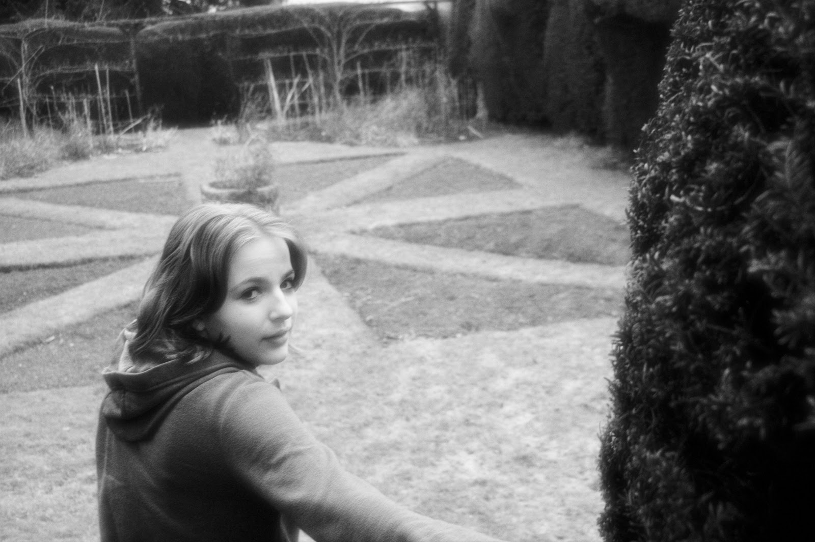
Photoshoot
Okay, so I was with Jade dovey and we went to Sibdon Castle that's in Craven Arms for any one who doesn't know where that is.
Anyway here's some of the photos that I took ^-^


Anyway here's some of the photos that I took ^-^


And there you go!
I hope you like them please tell which ones you like and which ones you don't like :)
some of these photos have been edited and some I haven't even touched.. yet :P
Thanks
Treatment sheet
Magazine name: Little Boom
Target Readership: Little Boom is an new alternative rock magazine who will be aimed at the 16-19 years old age range, the name of the magazine maybe deceiving "Little Boom" but this magazine has a lot to offer. The target audience will probably have incoming finances from part time jobs and Ema spending they're money on clothes, food and magazines. Little Boom aims to bring bright, exciting and entertaining bands and articles to the reader.
Form and style: Little Boom is a full sized A4 magazine , which will include gig reviews of signed and unsigned bands, posters, mix Cd's as free bees and as competition prizes, Competitions as well as fresh new bands and well known bands will be included on the front cover. Models which will be used on the front cover will be that of the bands and artists, signed and unsigned. The colour for the magazine will be purple, white and black as is it not known that any other magazine has this colour scheme.
Themes and Typical features: Little boom will include the following features in its magazine such as gig reviews, articles about new bands, latest news about well known bands/ artists, latest tracks reviews, up and coming events, quizzes, gig dates, interviews and many more!! The main feature in the magazine will be interviews from artists/ bands.
Potential advertisers: The brands which will be included in the magazine will vans, Ben and Jerry's ice cream, ripcurl, billabong, quiksilver, roxy, Drop dead gorgeous, Famous stars and straps, Atticus, Clandestine and maybe bands gig dates. The advertisers which will include clothing ranges from rockstars e.g. Famous stars and straps was created by Travis Barker. Also a listing of up and coming events for festivals, band gigs and CD releases.
Editorial team: For the editorial team a group of up and coming journalists and photographers will be selected to join as they have new ideas and this group of people will be around 24 years old as they can still relate to the readersby being informal in the text. The readers will also get involved by sending in questions for bands and suggestions for the magazine.
Friday, 21 January 2011
Font analysis
Okay so the votes are in and LITTLE BOOM wins :)
Here I have looked at some fonts for the title

and here i have looked at some fonts for the rest of the magazines writing

Here I have looked at some fonts for the title

and here i have looked at some fonts for the rest of the magazines writing

please comment on which one you like ^^
Colour analysis

Because I want my music magazine to have a fresh and young feel to it but as well as have a rock/ alternative / punk feel to the magazine. I have made a few various colour codes, please tell which one you like :)

PLEASE COMMENT BELOW!
Monday, 17 January 2011
VOTING!!
Okay, so guys i have a problem my poll for my magazine name is not working
soo can you PLEASE tell me below
Little Boom
Punk Roach
Empire Rhyme
Crashing Punk paradise
PLEASE VOTE! ^^
soo can you PLEASE tell me below
Little Boom
Punk Roach
Empire Rhyme
Crashing Punk paradise
PLEASE VOTE! ^^
ABC figures 2010 NME
NME has suffered from a year on year slump in sales, down by 17.3%, as well as having a slump in music and film titles.
NME had an average weekly circulation of 33,875 (in sales) in the six months to the end of June, according to figures released today by the Audit Bureau of Circulations.
Rivals to NME also suffered in a bad set of results for entertainment titles. Circulation of Bauer's 'Q' Magazine dropped 10.7% compared to the first half of 2009, taking it to an average of 89,450 per issue.
NME's sister title Uncut fared slightly on the better side but still fell with a 3.2% year-on-year drop to a monthly average circulation of 74,067. Bauer's heavy metal weekly 'Kerrang!' increased its average per-issue circulation by 1.8% to 44,013.
Music magazines (percentages represent year-on-year change)
The Fly - 108,207 (0.4%)
Mojo - 91,678 (-6.2%)
Q - 89,450 (-10.7%)
RWD -78,867 (1.7%)
Uncut - 74,067 (-3.2%)
Classic Rock - 70,323 (0.0%)
Metal Hammer - 44,034 (-4.3%)
Kerrang! - 44,013 (1.8%)
New Musical Express - 33,875 (-17.3%)
These figures were from Press Gazzette.
These results have concluded that I will still have to consider if my magazine made a decline in sales issues how I would be able to make them rise them again and keep them at a certain level. These sales figures are important to me and a company who is starting to come into that market because these figures can be a make or a break figures as the magazine market is very competitive.
Audience questionnaire
1.What kind of music do you like to listen to?
2.How much would you be willing to pay for a new music magazine?
3. Would gig reviews interest you?
4.Would you like to have gig dates for new bands and also well known bands in this magazine?
5. Would you be interested in a magazine who sold freebees such as posters and mix CD's of the new bands?
6.What type of genre would you like to see in this magazine, would you like more than one genre maybe a range genres?
7. Would you like to see a competition prize included?
8. How many times should this magazine be released?
textual analysis Q magazine front cover
Q
Issue: january 2010
Price: £3.90
Sections in magazine: 8
Pages in magazine: 162
Pages per section: 42
 On the front cover of Q magazine is a very simple yet impowering lay with the masthead taking up 1/6 of the page, the use of colours red, white and black have a strong hold on the reader who will be enticed to buy the magazine. In the picture I would define it as a crowd shot and a long shot however some peope are kneeling down. The strapline across the top is to illustrate how popular the magazine is making it more appealing to the readers. The masthead is confined to the top left showing more the graphics on the front page off.
Issue: january 2010
Price: £3.90
Sections in magazine: 8
Pages in magazine: 162
Pages per section: 42
Front cover
 On the front cover of Q magazine is a very simple yet impowering lay with the masthead taking up 1/6 of the page, the use of colours red, white and black have a strong hold on the reader who will be enticed to buy the magazine. In the picture I would define it as a crowd shot and a long shot however some peope are kneeling down. The strapline across the top is to illustrate how popular the magazine is making it more appealing to the readers. The masthead is confined to the top left showing more the graphics on the front page off.
Textual analysis of Music magazines part 2 Vibe (front cover and contents page)
For my next textual analysis of music magazine I will be analysing the music magazine Vibe
Vibe
Issue: Oct/ Nov 2010
Price: £3.95
Sections in magazine: 13
Pages in magazine: 120
Pages per section : 6 pages

Contents page
 The contents page is spilt into two halves, the left side has subtitles of the sections are in white; in serif writing with the numbers on the left of the subtitles those are also in serif writing. The magazine is spilt into features and departments, the features are the cover lines which were displayed on the front cover whereas the departments are the others articles which were not displayed on the front cover.On the other half of the page, on the right hand side there is a picture of Usher the Grammy award winner and billboard chart topper, standing in denim and a leather jacket lined with fur, this shows that he is the dominant male or the alpha male as he is standing with is right leg forward in a medium long shot.
Vibe
Issue: Oct/ Nov 2010
Price: £3.95
Sections in magazine: 13
Pages in magazine: 120
Pages per section : 6 pages
Front cover-
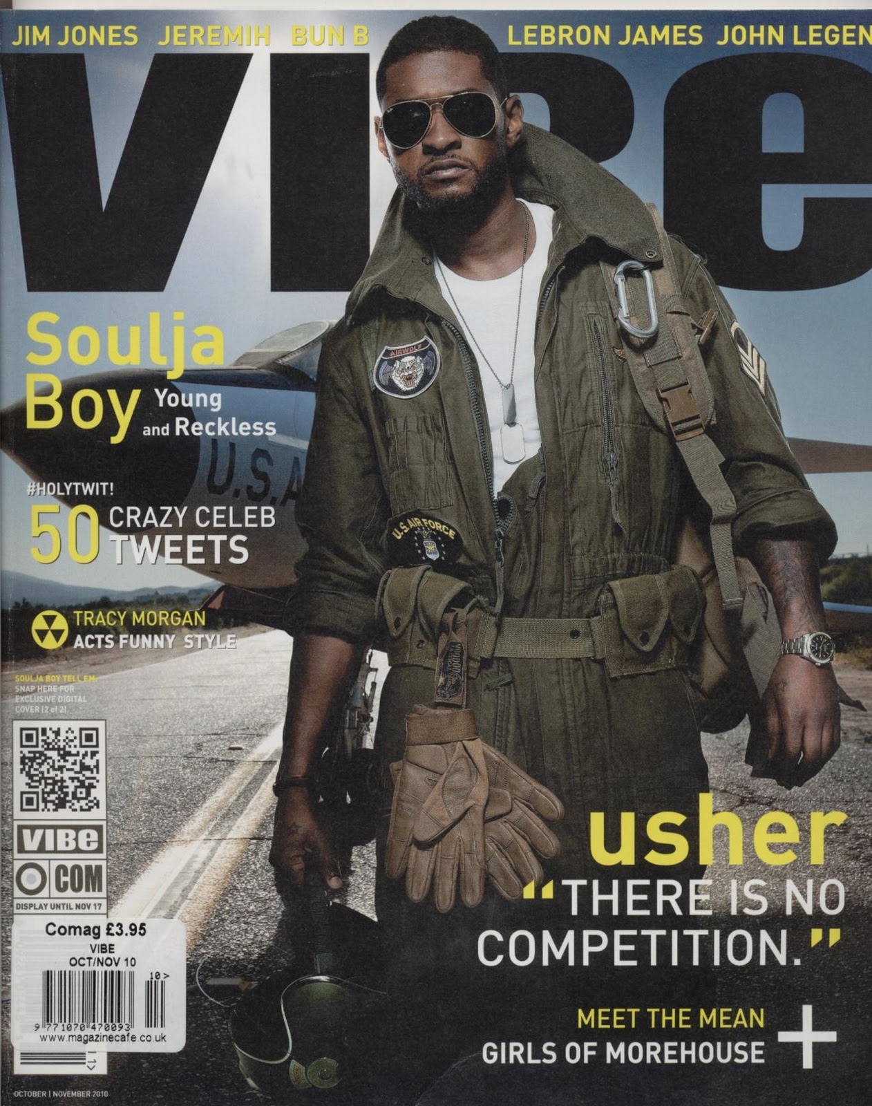
The front cover of vibe music magazine has a strong and empowering Masthead with sans serif writing showing the reader that this magazine modern and up to date with music and news, the model is also placed in front of the masthead.
The colour scheme which is used is Black, white and yellow, the positioning of the picture on the front cover is showing what kind of magazine it is, as the model is Usher a music chart topper, he is wearing an air pilot implying there is urban theme to the magazine and the quote 'There is no competition' suggesting that he is Top Gun, the most prominent male of them all.The use of lighting in this photograph is low key lighting.
Contents page
 The contents page is spilt into two halves, the left side has subtitles of the sections are in white; in serif writing with the numbers on the left of the subtitles those are also in serif writing. The magazine is spilt into features and departments, the features are the cover lines which were displayed on the front cover whereas the departments are the others articles which were not displayed on the front cover.On the other half of the page, on the right hand side there is a picture of Usher the Grammy award winner and billboard chart topper, standing in denim and a leather jacket lined with fur, this shows that he is the dominant male or the alpha male as he is standing with is right leg forward in a medium long shot.
Monday, 10 January 2011
Textual analysis of Music Magazines part 1 Kerrang (front cover, contents and double page spread)
Here is my textual analysis of 3 covers, 2 contents and 1 double page spread
Kerrang (onomatopoeia)
Issue 1293
Price: £2.20
Sections in magazine: 7
Pages in magazine: 63 pages

Cover-
There is a photo montage of the artists which are featured in the main article, the masthead is coming right across the top with a strap line just above it; this makes the masthead appear important and dominant. In the strap line there is an advertisement for a competition to win tickets to every show to the Kerrang relentless energy tour. The main picture on the front cover has a few of the leader singers in the article '50 albums you must hear in 2010', the banner for this feature stands out as it has a huge round red (primary colours used) banner and yellow text to make the main story jump out. The word Kerrang is an onomatopoeia and is the sound which is made when strumming a guitar is made.
Contents-
In the contents page, it is spilt into two half, the top half is taken up by 3 photographs two of which are thumbnails, one for Enter shikari and one for Emilie Autumn. The bigger photograph is for the main article of '50 albums you must hear in 2010'.
The use of frequent picture can relate back to the cover stories, the contents page is also spilt into sections with a section for the editor to write a letter to the reader, wishing them a happy new year and what is to be included in the up and coming issues.
The colour scheme for the contents page is black, yellow and white to keep it simple yet modernised.
Double page spread (DPS)-
The double page spread for this magazine is Placebo a gig review, the picture in this gig review takes up the majority of the two pages with the review of the bands gig on the left hand side, the review was written by someone who actually went to the gig instead of watching from YouTube and making an critical analysis of the bands performance in the venue itself.
Also in this double page spread there is a 'how was it for you?' where three people (one would be one of the band members e.g. the singer and two others would be the member of the public who watched the band) give there review on the bands performance.
Friday, 7 January 2011

Music Magazine Action Plan
Right I'm back with my music magazine front cover, contents and double page spread (DPS)
Here is my action plan for the next few months
3.1.11- Textual analysis of magazines/ poll for magazine name
10.1.11- internet research/ audience questionnaire and analysis
17.1.11- font analysis/ colour analysis
24.1.11- construction - audience feedback/ Photoshoot
31.1.11 - layout designs
7.2.11 - drafting of pages
14.2.11
21.2.11 -- half term --
28.2.11
7.3.11 - EVALUATION
I might include a weekly review about what I am doing each week
Subscribe to:
Comments (Atom)